Hellcat profile
Wed Jun 01, 2011 9:33 am
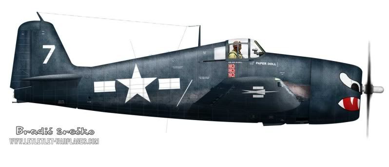
Greetings all,
I have complete this profile today:
Cheers
I have complete this profile today:
Cheers
Re: Hellcat profile
Wed Jun 01, 2011 9:41 am
hi srecko mate,
you need to study the fuselage shape to get the right form,you need to improve the highlight and the shadow, either that or your weathering layer is hiding it, you also are loosing the wing against the fuselage, apart from that your work is getting better.
you need to study the fuselage shape to get the right form,you need to improve the highlight and the shadow, either that or your weathering layer is hiding it, you also are loosing the wing against the fuselage, apart from that your work is getting better.
Re: Hellcat profile
Wed Jun 01, 2011 9:46 am
Pretty good, but ya gotta bring those bars up so their top edges are level with the horizontal line in the star. The bars should not be vertically centered in the US insignia.
August
August
Re: Hellcat profile
Wed Jun 01, 2011 12:42 pm
Thank you very much for your kind attention and time. August- you are absolutely right, I did transform angle of the start and it have to be as you said, can not trace history now and see in which step I make this transform. sagindragin- shadows and highlight are as on the image of this aircraft, very deep bottom and not much highlight over (loosing wing shape over fuselage can be noted on many images, not the particular one...). About the shape- would you be kind to point on the specific detail, please?
Cheers
Cheers
Re: Hellcat profile
Wed Jun 01, 2011 2:10 pm
i think it looks great
Re: Hellcat profile
Wed Jun 01, 2011 2:53 pm
On the shadows and highlights issue, most profile artists "cheat" by lightening the bottom of the aircraft so that the underside details and colors can be seen, as if there were a secondary light shining up from below. The most skilled ones do it in such a way that you don't notice it, although once you realize it is done and are looking for it, it makes most profiles presented in books etc. look a bit unnatural.
It comes down to a compromise between aesthetic interests and the desire to show the plane and its colors. Any time you have realistic shading effects, it will tend to obscure color and marking information. The most informative and useful type of illustration for these is actually the non-shaded cartoon-style drawing typically seen on model kit or decal instruction sheets, but they are not very realistic or attractive. If your purpose is mostly to have a realistic and attractive picture, then I'd say the shading effects can be left the way they are.
August
Re: Hellcat profile
Wed Jun 01, 2011 3:01 pm
Well, in some level including of the second light source can be good, in this way we have treat and profile like taken from image of aircraft in photo studio where is various type of light used. In nature we have primary sun as one direct source, the left is various illumination and reflection. At least take any book of Lumins and various way of adding shadows could be noted.
Thank you for comment whistlingdeathcorsairs
Thank you for comment whistlingdeathcorsairs
Re: Hellcat profile
Wed Jun 01, 2011 3:05 pm
Re: Hellcat profile
Fri Jun 03, 2011 9:26 am
sagindragin wrote:hi srecko mate,
you need to study the fuselage shape to get the right form,you need to improve the highlight and the shadow, either that or your weathering layer is hiding it, you also are loosing the wing against the fuselage, apart from that your work is getting better.
Hi, John. I noticed your " Dragon Tech " logo. Is there a site, where I can see your work? The last I saw was the Singapore.
I still have the Hudson as one of my desktop images.
Chris