Re: Dislikable paint schemes and markings
Fri Aug 27, 2010 5:03 pm
G-FIRE & G-FURY looked great, imho. I bet someday soon someone will do a retro 60's-70's civilian scheme on a Mustang....I'd love to see one overall gold with black or purple trim. Sweet!
greg v.
greg v.
Re: Dislikable paint schemes and markings
Fri Aug 27, 2010 5:04 pm
The airworthy B-25, Barbie III, looks great in its CBI Air Commando scheme with white diagonal fuselage stripes.
TonyM.
TonyM.
Re: Dislikable paint schemes and markings
Fri Aug 27, 2010 6:34 pm
kalamazookid wrote:... and I think the "Tomcatters" scheme doesn't look very good on it. Maybe if they tried doing more of a retro scheme it would look better, but the way it is now just isn't attractive to me. Just not nearly as classy-looking an aircraft or scheme as the unit has flown previously.
I was generally of the same opinion as you. Then I saw this:
http://www.fencecheck.com/forums/index. ... 2881;image
If only they'd painted the radome black. I am now anxiously awaiting decals to come out for that one. I do think that the Bones of VF-103 do look kinda weird on the Super Bug, even more so than Felix once did.
Re: Dislikable paint schemes and markings
Sat Aug 28, 2010 3:27 am
Barbie III, looks great in its CBI Air Commando scheme with white diagonal fuselage stripes
Agreed! Although since we're nitpicking in this thread, I've always wondered why they painted her OD overall, when she should be neutral gray underneath.
Speaking of the National Insignia, one of my pet peeves is the way the bars are often applied. Aside from being misproportioned, I often see the insignia painted as a simple star-in-circle with the bars tacked on the sides, like this:

The insignia is actually a star-in-circle, with white bars, and a blue border surrounding the whole thing (replacing the red that was added in the spring of '43) like this:

I know 99% of people don't even notice, but to a geek like me it sticks out like a sore thumb!
SN
Re: Dislikable paint schemes and markings
Sat Aug 28, 2010 6:57 am
Interesting thread! Just a couple of observations-
Money doesn't always buy good taste or class (and there is definitely some classless BAD taste out there).
But if we all liked the same things, there would only be vanilla or chocolate ice cream.
There are generally 2 scools of tastes for most objects-those that like shiny stuff, and those that can't stand it.
Neither one is the 'right' way. IMO, it's just how some prefer it.
Personally, I DO like to see a faithful restoration-(including matte paints).
They manufacture much better quality paint today, but the high gloss finish just looks 'wrong' on most WWII aircraft with military markings.
I also like tastefully creative work on vintage aircraft. There's room for lots of personal expression out there.
BTW-someone has to invent the new paint schemes that will be 'restored' as historical-some 50 or 100 years from now!
As a wise friend of mine always said: "There's an a*s for every seat".
Re: Dislikable paint schemes and markings
Sat Aug 28, 2010 9:34 am
No more red Fokker Triplanes please.
-
-
Re: Dislikable paint schemes and markings
Sat Aug 28, 2010 10:06 am
Baldeagle wrote:No more red Fokker Triplanes please.
-
Amen!
Re: Dislikable paint schemes and markings
Sat Aug 28, 2010 9:28 pm
Cvairwerks wrote:I wouldn't say that I truly dislike any of the schemes out there, but I am severely fatigued at seeing two things. I am so tired of seeing invasion stripes and seeing the same basic scheme repeated over and over again. I wish that other owners would take a little time and look around at what's already done and what can be found with a little research. I for one, would rather take a bit of time and find something different for my paint scheme, so that it will be different enough that it makes it memorable on it's own, rather than it's just another cookie cutter paint job.
Hear, hear. I'll give you my personal opinion on paint jobs. I like to see things which are (to me) interesting (civilian colors are good) rather than schemes that are 100% spot on in accuracy. Also, some people might like it, but for me seeing a row of "Cripes A' Mighty" or "Red Dog" IV through MMLXVIII is kinda boring. One of the 51s I personally liked was N201F with the 354th FG looking colors. Different and nice. Saw it at Columbus, OH and it was great to see something besides 4th, 352nd, and 357th FG. Fast forward in time and guess what, a 4th FG paint job is applied... I never got to see the old McCann C-FFUZ in the black colors and of course it was stripped when in Ohio. I imagine we'll see another 8th AF job on it soon...
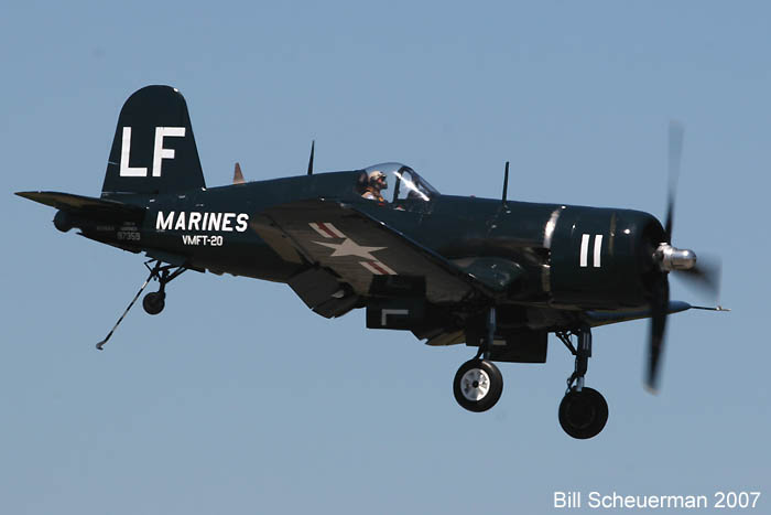
And what is the thing with a lot of types of fighters apart from the 51? Mustangs usually get painted with nose-art and all the bells and whistles, but aircraft like the Corsair are almost all the time very dull. There was a couple of rare and interesting schemes out there like N240CA in the VMFT-20 colors, seen here:
http://www.warbirdregistry.org/corsairr ... 97359.html

A colorful and interesting scheme. Get points for being unusual as well (think its only been on Bogue's F7F), and interesting as it featured a training sqn. Now looking like this, to me plain and boring...
http://www.warbirdregistry.org/corsairr ... 97359.html
Or the old Lindsey Walton -7 now with Jack Erickson. When it was interesting:
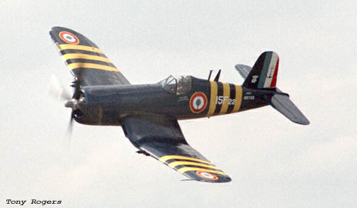
Now looking like this:
http://www.flickr.com/photos/kensaviation/2140702166/

And for those who thrieve on accuracy that is one a/c that should have been left in the Aeronavale colors as the -7 was made for the French.
T J
Re: Dislikable paint schemes and markings
Sun Aug 29, 2010 10:13 am
I know I'm going to get "beat-up" for this but...
I've never been a fan of painting a plane silver when it should be natural metal finish. It never looks right. Better to go with another paint scheme i.e. OD green, black, (whatever other scheme that type may have worn) than to go with the painted silver look...
I've never been a fan of painting a plane silver when it should be natural metal finish. It never looks right. Better to go with another paint scheme i.e. OD green, black, (whatever other scheme that type may have worn) than to go with the painted silver look...
Re: Dislikable paint schemes and markings
Sun Aug 29, 2010 12:07 pm
The problem is not "authentic" or "not authentic" scheme.
There are for instance, especially in the sixties, many Mustangs which were painted in very aesthetic civilian markings.
I can also think to this German P-51 which is all aluminium, it's a beauty this way by itself. No problem with that.
No, there is a problem when an authentic scheme is applied with not enough care for the research or the painting work.
Re: Dislikable paint schemes and markings
Wed Sep 01, 2010 3:22 pm
Could I also mention Mustang interior glass framing painted grey or green? These are not authentic but what's worse, they cause a reflection in sunlight that interferes with outside vision. More of my 2 cents.
 VL
VL
Re: Dislikable paint schemes and markings
Thu Sep 02, 2010 12:46 am
Vlado wrote:
I'm starting to notice a pattern here. It seems that your "2 cents" are usually worth more than most other "2 cents". I should be able to expoit that somehow. Funny, how us Wall Street guys tend see the potential for arbitrage in everything.
It was good to see you in Mexico.
More of my 2 cents.
I'm starting to notice a pattern here. It seems that your "2 cents" are usually worth more than most other "2 cents". I should be able to expoit that somehow. Funny, how us Wall Street guys tend see the potential for arbitrage in everything.
It was good to see you in Mexico.
Re: Dislikable paint schemes and markings
Thu Sep 02, 2010 7:01 am
Thx. Mexico (MO) was certainly fun!
VL
VL
Re: Dislikable paint schemes and markings
Thu Sep 02, 2010 7:11 am
I'd like to offer an idea here... there's a certain L-5 that I'm aware of that has a hideous non-historical paint scheme mentioned earlier in the thread... We currently have 4995 listed members here on WIX. If half the membership could come up with $3.00 each, I could have the guys at the Alamo Liaison Squadron get it repainted. I'd bet, if we got enough support there, that we could also do something cool, like maybe have the inside of the stretcher area door (not visible in flight like a "tramp stamp") with a nice advertisement for WIX. We could also make a "fake" wartime style bit of nose-art like this:
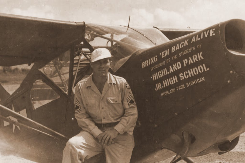
Maybe we could make it a once-a-year deal to help put an aircraft into decent markings.
Ryan
Maybe we could make it a once-a-year deal to help put an aircraft into decent markings.
Ryan
Re: Dislikable paint schemes and markings
Thu Sep 02, 2010 7:16 am
That would be awesome. I would be in for that!