This is the place where the majority of the warbird (aircraft that have survived military service) discussions will take place. Specialized forums may be added in the new future
Post a reply

Re: Dislikable paint schemes and markings

Wed Aug 25, 2010 9:51 pm

The scheme I really don't like is when some "weekend" pilot paints up his Cessna, Piper, or homebuilt in a military paint scheme - whether it be W.W. II or modern. These "wanna-be's", for some reason, really irk the h3ll out of me! I don't know, maybe it's because I think it "cheapens" the role the aircraft and Veterans played in defending our freedom.


Has anybody painted one like "Old Crow" yet? 8)

Ducking and running...........

Re: Dislikable paint schemes and markings

Wed Aug 25, 2010 10:14 pm

My pet peeve? Vietnam camo schemes on so many F-84Fs. Although it's probably better for hiding the corrosion on the ones that are sitting in front of VFW posts, which is to say most of them... :wink:

(Second worst: Helvetica or other modern fonts used for serials and other markings on display aircraft, especially a certain B-17F!)

Re: Dislikable paint schemes and markings

Wed Aug 25, 2010 10:25 pm

I don't have any problems with the way anyone wants to paint their warbird or Cessna for that matter. It's their plane, their money. What irks me more is when some guy spends a couple million to have an aircraft restored and paints it up in a manner that will protect it from the elements for the next fifty years and then people who havent done anything to help put that aircraft back in the air sit and criticize it for not being accurate. If you want to paint a warbird to perfectly accurate standards, then I'm sure Mark Clark would be more than happy to sell you any of those he currently has listed. God bless all those guys out there who have the money and passion to keep these aircraft flying so we have something to show our grandkids. OK, I'm off my soapbox now

Re: Dislikable paint schemes and markings

Wed Aug 25, 2010 11:38 pm

Here are mine:

1. Modern nose art on restored Tigercats. They're friggin' ugly. Nobody is going to convince me otherwise.

2. Never liked any sort of camouflage on the F-104. They're a sleek plane, and I think the natural metal finish highlights their lines a lot better. There's nothing about any of the camouflage schemes I've seen that enhances the lines of the plane.

3. The "Tomcatters" scheme on Super Hornets. That's just wrong. It would be like having a girlfriend die and then dressing up someone else in her clothes and calling her the same name. It's just weird.

4. The "Mod-Eagle" F-15 scheme. It makes the F-15 look like a dark blob rather than a sleek fighter.

5. Any A-24 paint scheme. I've yet to see one that's mildly visually interesting. That's not to say they aren't cool looking aircraft, but there's nothing visually stimulating about any of the paint schemes.

Re: Dislikable paint schemes and markings

Thu Aug 26, 2010 12:33 am

Pogo wrote:Hah, you think you're gonna catch crap? I'm sorry, but I DETEST tramp stamps.


Ditto, they look like crap.....

..... coming from a guy with a '70 Ranchero that has a 78thFG paint job on it... :lol:

Re: Dislikable paint schemes and markings

Thu Aug 26, 2010 1:18 am

Chris wrote:I don't have any problems with the way anyone wants to paint their warbird or Cessna for that matter. It's their plane, their money. What irks me more is when some guy spends a couple million to have an aircraft restored and paints it up in a manner that will protect it from the elements for the next fifty years and then people who havent done anything to help put that aircraft back in the air sit and criticize it for not being accurate. If you want to paint a warbird to perfectly accurate standards, then I'm sure Mark Clark would be more than happy to sell you any of those he currently has listed. God bless all those guys out there who have the money and passion to keep these aircraft flying so we have something to show our grandkids. OK, I'm off my soapbox now


VERY well said, Chris. I am not a fan of the "I don't like" direction of this thread. Just my opinion though.

Re: Dislikable paint schemes and markings

Thu Aug 26, 2010 5:59 am

This thread was not ment to offend anybody. This thread was more about likes and dislikes of colors.
Last edited by Nathan on Thu Aug 26, 2010 6:31 am, edited 2 times in total.

Re: Dislikable paint schemes and markings

Thu Aug 26, 2010 6:16 am

This thread was just meant to be fun I am sure. We are simply talking about our likes and dislikes as far as paint schemes go.

Re: Dislikable paint schemes and markings

Thu Aug 26, 2010 6:38 am

me109me109 wrote:
Chris wrote:I don't have any problems with the way anyone wants to paint their warbird or Cessna for that matter. It's their plane, their money. What irks me more is when some guy spends a couple million to have an aircraft restored and paints it up in a manner that will protect it from the elements for the next fifty years and then people who havent done anything to help put that aircraft back in the air sit and criticize it for not being accurate. If you want to paint a warbird to perfectly accurate standards, then I'm sure Mark Clark would be more than happy to sell you any of those he currently has listed. God bless all those guys out there who have the money and passion to keep these aircraft flying so we have something to show our grandkids. OK, I'm off my soapbox now


VERY well said, Chris. I am not a fan of the "I don't like" direction of this thread. Just my opinion though.


No one forced you to post in it or even read it. Discussing warbirds is what people do here. I find it funny that people have this attitude of "How dare you question a warbird owner." Guys they aren't Christ. They just own an airplane. We are also assuming that everytime that there is a paint scheme deviation that it is on purpose. There are times when they just get it wrong. I believe that just recently Jack Cook found proof that the Pima Mustang had the wrong color spinner. Pima changed or is changing the color of the spinner to match Jack's photo. So now there is an aircraft that is more accurate out there due to a WIX thread.

Re: Dislikable paint schemes and markings

Thu Aug 26, 2010 7:03 am

Mostly just the zillion bogus Thunderbird/Blue Angel marked birds on display out there... :roll:

-Derek

Re: Dislikable paint schemes and markings

Thu Aug 26, 2010 7:26 am

me109me109 wrote:VERY well said, Chris. I am not a fan of the "I don't like" direction of this thread. Just my opinion though.

What Taylor said...
I guess you could say I "don't like" the current paint scheme on our L-5, but we inherited it when we bought the plane, and if anyone wants to give us 6K, we'll repaint it in a heartbeat! In the meantime, I LIKE flying it!

Ryan

Re: Dislikable paint schemes and markings

Thu Aug 26, 2010 8:12 am

warbird1 wrote:and I don't expect everybody to agree with me.


I don't think anybody is going to agree with you., but it is just your opinion and you are certainly entitled to it.., especially on this site! Nobody has more stronger opinions posted on the web, than here!! LOL

Re: Dislikable paint schemes and markings

Thu Aug 26, 2010 8:20 am

Chris Brame wrote:Helvetica or other modern fonts used for serials and other markings


That was going to be my post. Glad I have some brotherly support for this one. The sad thing is that sometimes these markings can "become" accurate. When a few of our C-130's came back from heavy maintenance and re-paint, the Wing assignments were re-applied in a modern, generic, curvy font. I think it's nasty, but it is now "authentic". Maybe there's a T.O. that dictates the proper font and I can write it up in the 781's :wink:

As far as "not liking" the paint on someone's airplane - it's a comment of taste, not a personal insult, nor a request that they change it. The original owner of my RV-8 put a red & yellow checker around the cowl to salute the 357th FG. I never cared for it and still don't, but to repaint and match the cowl seems like more work and expen$e than it's worth, so I leave it alone. I'm the first to admit I don't like it (and it's my friggin airplane) yet, in a strange twist, I've had a number of positive comments on the marking. Bottom line, I don't care what folks say - it is what it is.

Since I'm on a roll, I never really cared for early AAC markings with the red meatball and striped rudder, either.

Ken

Re: Dislikable paint schemes and markings

Thu Aug 26, 2010 8:47 am

Hate : gloss, chrome, modern pinups, sharkmouths everywhere.

Re: Dislikable paint schemes and markings

Thu Aug 26, 2010 8:50 am

Some of my peeves are already out there. The really garish and outlandish schemes like the CAF Wildcat are easy to pick on.

Here's a new one though -- improperly constructed national insignia. The specs for the size and shape of the US stars 'n bars have been the same since 1943, so even a current USAF manual can be used to get this right, and the correct proportions are repeated in countless books. I remember in a special issue of EAA Warbirds magazine in 1981 or 82, they published the correct specs and wrote, "Hey guys, no excuses now, get it right from now on!" Well, some did, and many continue not to. The worst offenders seem to be trainers and L-birds but there are plenty of fighters and bombers with incorrect insignia. (Sometimes it is offered as an excuse that wartime insignia were sometimes painted incorrectly, especially when modified in the field, but this happened rarely -- an actual example is the NASM's XP-80, which has incorrect bars that faithfully reproduce Lockheed's wartime error -- and is seldom a valid excuse.) To me these errors seem like putting the wrong number of stripes or stars in the US flag; bordering on disrespectful.

British insignia are easier to get right and restorers in the UK seem more attentive to these details. The most common mistake is to use too-bright shades of paint for the red, and sometimes for the blue or yellow. Canadian insignia are frequently a disaster because of the variety and complexity of the maple leaf device and the different roundel proportions used at different times and by different services. Most Canadian restorers are getting it right now, but when US or UK restorers attempt a Canadian scheme, the results -- though honorable in intent -- are often comical. I saw a Chipmunk at Geneseo this year that somehow managed to get every single element of the RCAF paint scheme wrong, including the use of helvetica font for the lettering and the replacement of the Canadian red ensign with an Ontario provincial flag!

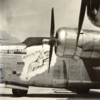
I have a minor peeve with aircraft that make WWII paint schemes seem more colorful than they really were by mixing and matching elements from different places and times. An example would be numerous 8th AF marked P-51s that combine extended nose markings, which came into use starting around January 1945, with invasion stripes that were long gone by then. CAF's red nose is one of many examples. I just surprises me that the actual, accurate 8th AF markings of that period are still not colorful enough for some folks.

I dislike nose art that looks as if it was painted by an amateur skateboard or custom van airbrush artist. Also, a lot of warbirds carry names and nose art reflecting two themes that were not common during the war, (1) hyper-patriotism and (2) nostalgia. These tend to paint a misleading picture of the values and attitudes of wartime crews, to the extent people assume they are authentic.

ETO call letters replaced by the owner's initials are thankfully much more rare than in the past, but there are still a few around (e.g. Spitfire T-B). This is especially vexing because in the wartime RAF, this was a privilege granted to Wing Leaders, so owners who do this are giving themselves quite an exalted, and un-earned, rank.

Since some people are uncomfortable with the negativity of this thread, it feels appropriate to point out how much great work is being done with paint these days, both by flying and static owners. A lot of the planes coming out of the shops today are really meticulously done. Many organizations have cleaned up their act a lot. Compare, for example, POF's P-47 paint scheme done many years ago with their P-38 or P-51A. Or the way the CAF's SBD was painted 20 years ago compared to now. The Luftwaffe paint schemes being applied to the new Fake-Wulfs and Mock-262s are really beautiful. When I walk through a lineup of trainers or l-birds at a show, typically I see 2 or 3 near-impeccable finishes for every howler. Among static museums, I would say the Pensacola collection, whatever its initials are these days, is the most improved compared to the inaccurate schemes I was seeing there in the 1980s. The NMUSAF and Rockcliffe have raised their games as well, although the latter still has some messes from the 1970s that need cleaning up.

August
Post a reply