These decals caught my interest after I read this thread, and the decals that I ordered came today. I thought I would bash out a quick review for you guys. You might also like the accompanying pics of the subject aircraft, which are from its appearances at Oshkosh 1976 and 1978 (when it was still Tipsy Miss) and 1980.
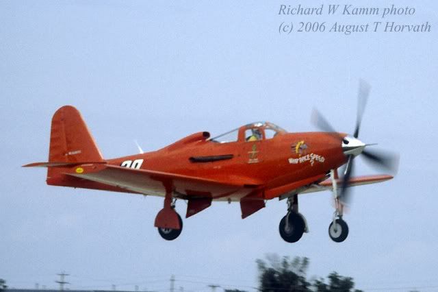
I ordered the 1/72 decals for Mike Smith's P-63 racer "What Price Speed?" This was the first 63 that I ever saw and photographed, as well as the first souped-up unlimited. I always liked the orange paint scheme.
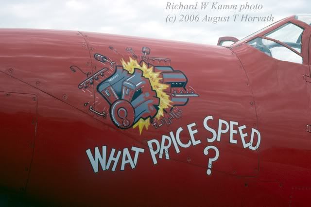
The decals are finely printed and in good register. The representations of the "What Price Speed?" logo and Kingcobra design on the door appear to be accurate in both design and coloring. However, I think that the "What Price Speed?" design may be considerably undersized.
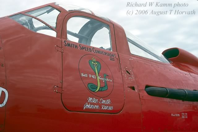
The decal includes script to go above and below the Kingcobra design on the door, but these are incorrect. The script above the cobra says "John Sandberg" in white, whereas it should say "Smith Speed Conversions Inc." in black with white lines, as shown above. The script below the door is illegible but also clearly incorrect, and appears to be a representation of the "Tipsy Miss" period rather than the "What Price Speed?" period. The lettering on the engine cover panel is not on the sheet.
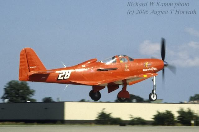
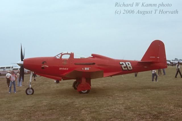
I could have lived with all of that, but then I noticed the more glaring inaccuracy. The sheet includes four "28" numerals, but all of them slope to the left, like "\". On the real aircraft, that would be accurate for the port side of the fuselage, but on the starboard side, the "28" sloped to the right, like "/". See pic below:
There is no numeral on the sheet that accurately represents this.
Two of the four "28"s on the sheet are supposed to go above and below the left wing, according to the 4-view drawing which is all the documentation you get. When I saw this aircraft and in all the pics I have of it, it had no numbers on the wings at all:
In addition, the N-number and two tiny Champion logos are provided. The 4-view does not indicate where to put the Champion logos. "What Price Speed?" actually had Pennzoil, not Champion, logos on the end plates of its clipped wingtips; however, in its late Tipsy Miss days, it did have Champion decals as shown below:
The 4-view incorrectly directs that the N-number be placed on the fuselage below the horizontal stab, where actually it should be up on the vertical fin.
Finally, the 4-view does a poor job of assisting the modeler in figuring out what physical modifications to the model are needed. The 4-view shows the wings and horizontal stab clipped, but does not say by how much. It does not point out the larger air scoop behind the cockpit, does not illustrate the extensive mods to the wing root fillet at both the leading and trailing edge, and depicts the spinner and exhausts as stock units whereas actually "What Price Speed?" had a pointed spinner with a long probe and a single collector exhaust.
Probably there are other mods to the aircraft that I don't know about that are also not shown. It would also be nice if the sheet contained paint color call-outs for the interior, wheel wells, and other such parts that always vary from stock colors on a custom racing aircraft.
In sum, although I have only examined this one product, I cannot recommend the decals. Because of the incorrect "28" number style, the sheet flunks the fundamental test: you can't use it to create an accurate replica. Beyond that, the documentation is both inaccurate and incomplete. Even if the decals were accurate, the modeler would need a great deal of research material and information to make the correct mods to the kit, paint it the right colors, and place the decals accurately. When a producer charges $8.00 for a decal sheet that measures less than 1 inch by 2 inches, the customer has a right to expect a little more help, it seems to me.
August